Tabletop Stories, Built Piece by Piece
David Honor uses the Tamron SP 45mm F/1.8 VC lens to create one-of-a-kind 'photo illustrations' using an ever-evolving setup of antique and modern-day props.
More Photo Tips | Video Gallery | Photo Gallery | Enewsletter sign-up
By Jenn Gidman
Images By David Honor
Retired commercial photographer David Honor has more than five decades of imaging experience under his belt, starting with his work with the Associated Press in the late '60s. From there he moved on to a wide range of assignments and genres, including creating corporate travel posters, working on contract for a tourism bureau, serving on the photography staff at a couple of magazines, and working in a number of Chicago studios, where he served as the in-house photographer. In 1989 he joined the Leo Burnett ad agency, where he shot campaigns for major clients like Marlboro, Johnnie Walker, and Kellogg's.
"I've shot just about everything but high fashion—people, animals, you name it," David says. "Throughout my career I was lucky and fortunate enough to work with some incredibly creative and talented art directors, designers, and production pros—all of whom I learned a great deal from. They helped me create and refine my creative vision and talents. I owe a lot to all of them."
After running his own studio for a while, David finally retired a few years back and set his sights on freelancing—and one of the genres he now dabbles in is a specialized type of tabletop work he calls "photo illustrations," in which he merges antique photos and props into unique narratives. "Some are personal, some are for clients," he says. "It's a look that's a continuation of the work I did for Burnett. I love creating these little vignettes. I have hundreds of props at home, and I simply mix and match them to create each image."
Read on for David's explainer on the process involved in creating these customized, one-of-a-kind photo illustrations from scratch.
****
I mainly find the old-time prop photos I use at antique stores, online, and at garage sales. They're usually pretty inexpensive. I probably have 300 photographs by now, from the 1800s on. There are some historical items in there.
I've also got a whole stack of old letters I use as props, including an old suicide letter that I found on eBay. It was in a $25 packet of letters, ranging from 1890 through 1930, that was being sold by someone in Ohio. I bought them for visual purposes, but once I received them, I went through them out of curiosity. That's when I found this one from a guy to his girlfriend, saying he was going to take his own life. I never know what I'll find.
I've been using the Tamron SP 45mm F/1.8 VC lens for my tabletop work, and I love it. It's incredibly sharp, and it also gives me the focal length that works for these vignettes. I first used the 45mm to photograph people, and when I transitioned to using it for my tabletop work, I was incredibly impressed. This lens somehow captures exactly the look I'm going for: immediacy and personal contact with my subjects, where it looks like you can almost reach out and touch everything in the image.
I set up a little studio in my basement, so I don't have to bear the expense of reopening a studio in town. My lighting setup consists of Speedotron and AlienBees strobes, and I typically use just one or two lights for each session. I might use a card fill or maybe some mirrors, perhaps some tricks that involve bouncing light back in. I supplement all of that with some Photoshop tweaking to get the look I want.
My camera is always on a tripod and tethered to my computer, so I can see everything up on the screen as I shoot and adjust accordingly. I use Capture One editing software as I'm taking pictures, so I can bring my highlights down and my shadows up, adjust my color and contrast—whatever I have to do to get my photos to look just the way I want them to.
The backgrounds I use are a carryover from the work I did for Marlboro. Back then, we shot a lot of images on barn wood and rusted old tailgates. I've been down to Texas a number of times on shoots, and I always manage to find something to bring back home. I'll look for eye-catching textures to place things on, which is why I often use old cutting boards. Some of the ones I own have been around since the early 1900s and are nicely aged and weathered.
For each shoot, I have a basic idea of what I want to do before I go into it—maybe I'll have a new prop I want to play with, or a general concept I want to experiment with. I'll put a tabletop up and pull out some props I think would work within the parameters of that concept, and I'll lay them all out and find one central prop I want to use, whether that's a book, a prop photo, or a piece of clothing. From there, I'll layer other props onto that central item, always making sure all of the props are from the same time period, so the overall image feels as authentic as possible.
My years of experience taught me to build a photograph in front of the camera like that. While current trends lean toward assemblies and multiple images layered into a final image, I still like the creative challenge of creating an image as a stand-alone, then using Photoshop and other tools to massage that image. I shoot images to create a story—not necessarily a story that viewers would know right away or that's obvious, but one that speaks personally to them.
I'll typically start each shoot at about a 45- or 50-degree angle, from the perspective of someone who might be sitting down and looking directly at the tabletop. That's my starting point, and then I adjust it from there, depending on what the subject is and what the props are. Sometimes it makes more sense to shoot straight down on everything. The more I build the set up, and the more props I add in, I'll tend to elevate myself, because I need to get more into the photo.
One thing I like to do with many of my photos is embed little treasures into them. It might be a face in a photo or other visual element that doesn't jump out at you right away, because it's in a shadow or peeking out from a corner. Then, eventually, as you look deeper into the image, you'll discover it.
I love the post-processing part of my creative process. I'll bring all my files into the computer, then use Adobe Bridge to do a basic correction on all of my images, adjusting tone and color and making sure everything is sharp. Then I'll pick one image from the series I like the most and put it through whatever filters I think will work best to enhance it even more, whether that means making the photo more dramatic, bringing out the shadow details, or what have you. Post-processing helps me bring out the mood of each image.
Let me explain how I "built" some of the photo illustrations you see here.
Farmboy Dreams
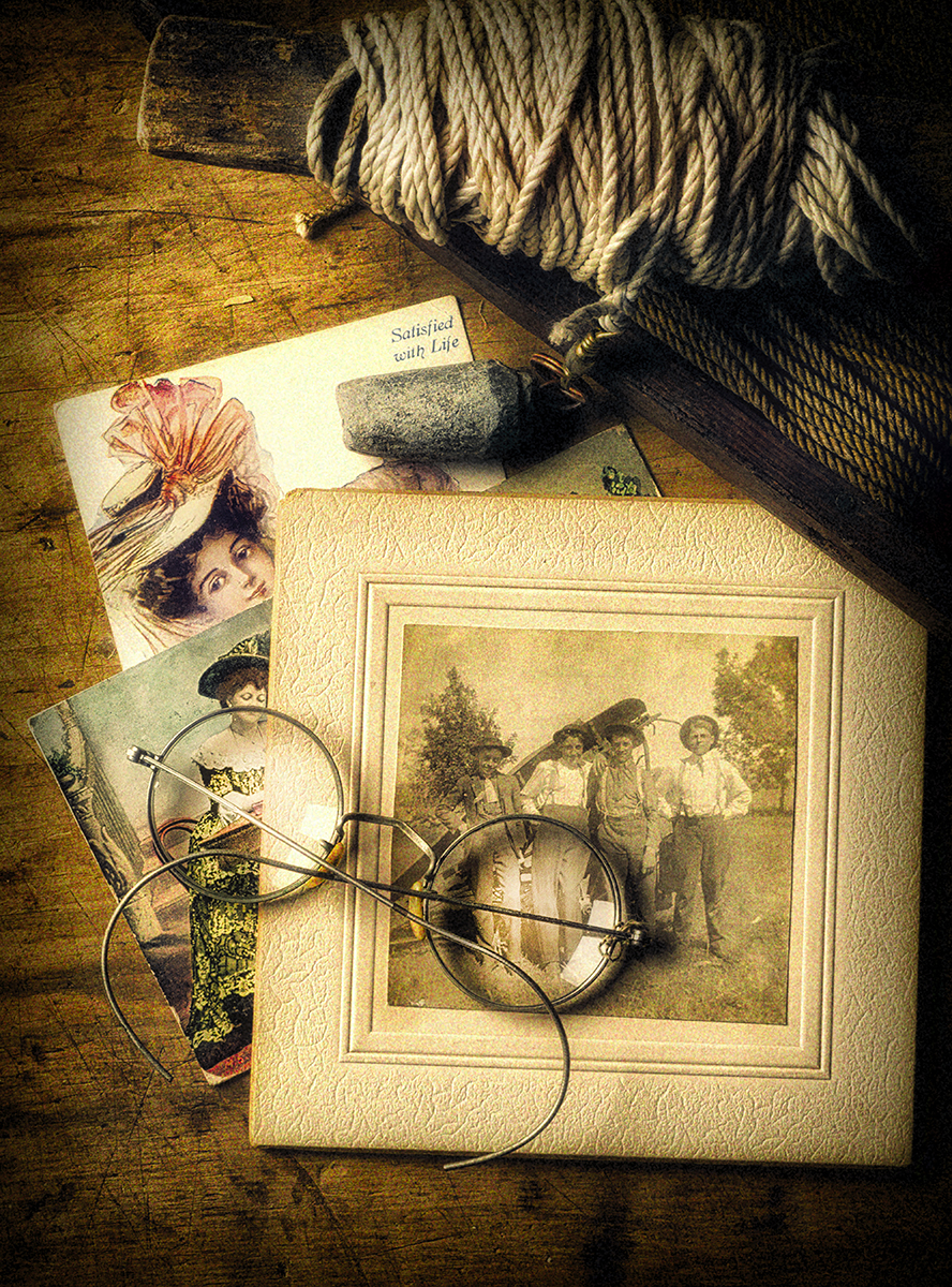
45mm, F/14, 1/160th, ISO 100
Click image to view larger
Nothing I incorporate into my photos is accidental. I put a lot of thought not only into the props I choose, but also into how I work them into the image. Take this picture, for instance, in which I use eyeglasses, a trick I often pull out to highlight something specific in a photo. The glasses you see here weren't just randomly thrown in: I placed them just so, so the woman is highlighted and the boys are highlighted. I also opened up the exposure just a tad in post-processing to emphasize that part of the image even more.
That touches on my love of post-processing once again, which I used here to create what's essentially an inverted S-curve within the photo. I wanted the viewer's eye to start with the rope and the weight, then travel down through the prop photos of the women to finally land where the glasses are.
Yellowstone Memory
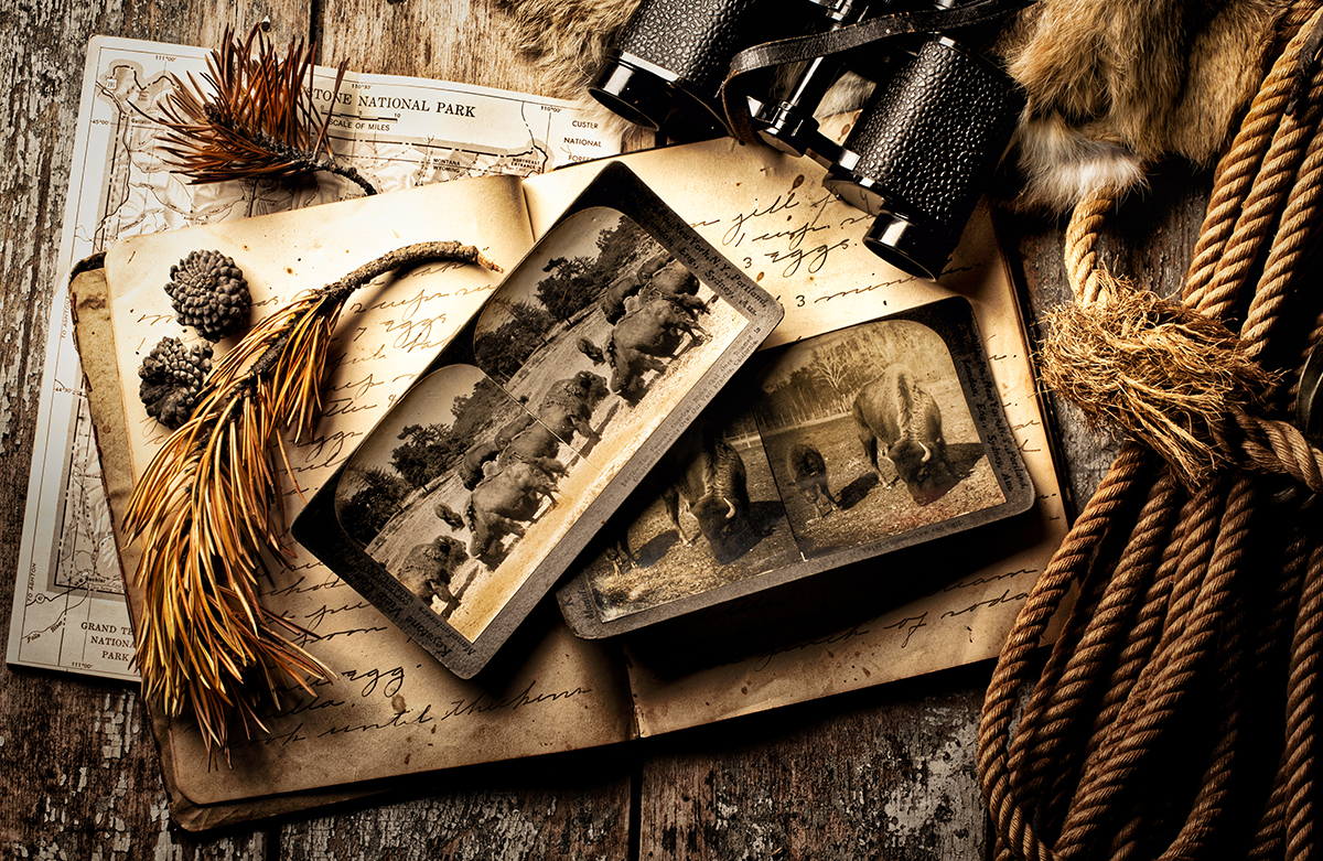
45mm, F/14, 1/160th, ISO 100
Click image to view larger
My wife and I visited Yellowstone National Park, and because I knew I wanted to create a photo based on our trip, I collected a whole bunch of pine cones and tree pieces while I was there. When I got home, I dug up some prop photos I had of buffalo, as well as the old journal, map, rope, rabbit skin, and retro binoculars. The background is a weathered barn door I had lying around. When you look at the photo, you feel like you're seeing the documentation of someone who just came back from visiting Yellowstone in the 1800s, with everything they accumulated there. I like to put together photos like this when I return from many of my trips.
Back From the Trail
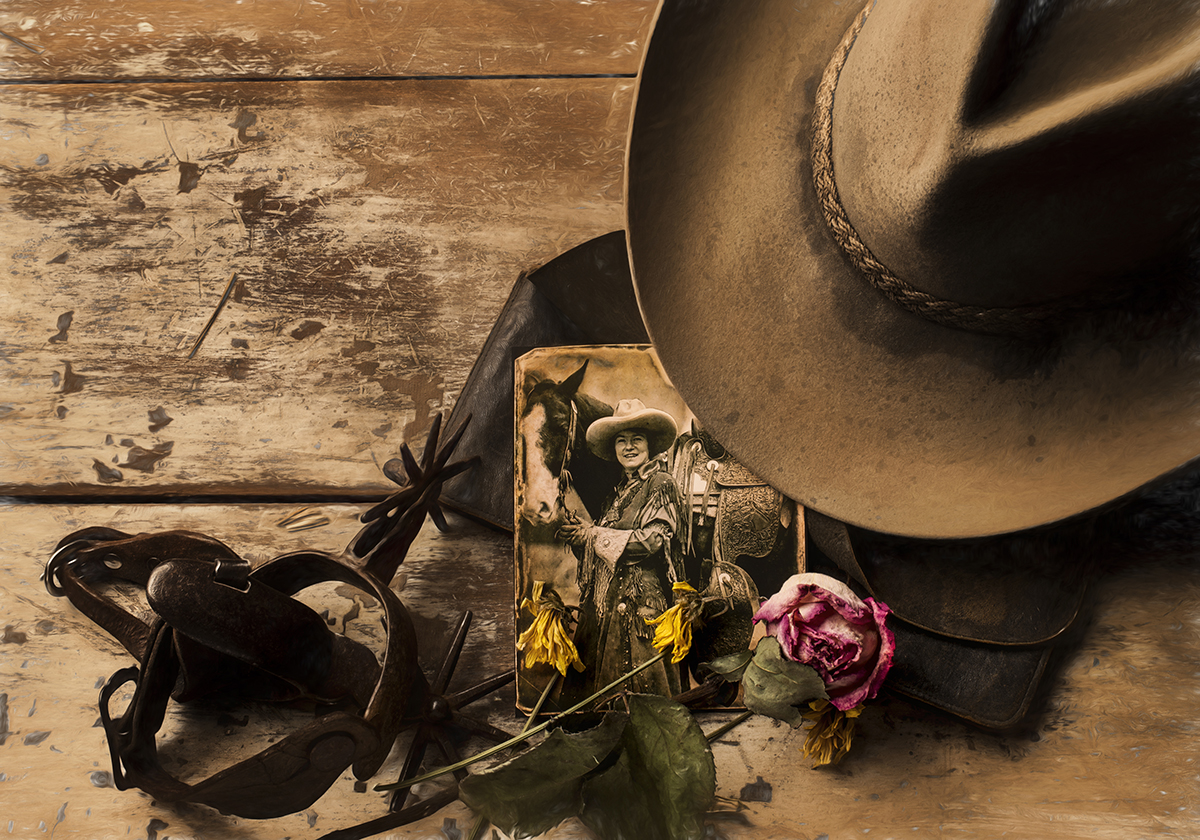
45mm, F/16, 1/80th, ISO 100
Click image to view larger
The prop photo in this image was a reproduction—a large 8x10 black and white on glossy paper. I wanted it to look like a real print from the 1800s, though, so I scanned it, aged it, toned it, printed it on photo paper, and weathered the edges of it. To age the hat, I used an old trick I learned from doing work for Marlboro: I sprinkled coffee and brown tempera paint on it. I had the spurs and chaps in my props stash, and the background is the other side of the barn door I used for the Yellowstone image. I added in the flowers because I wanted to emphasize the femininity of the cowgirl in the prop photo—maybe she picked those flowers on the trail, or someone gave them to her and she's been holding onto them for a long time, which is why they're dried out. I also like the color they add, as the rest of the photo is monotone.
Roses in the Rain
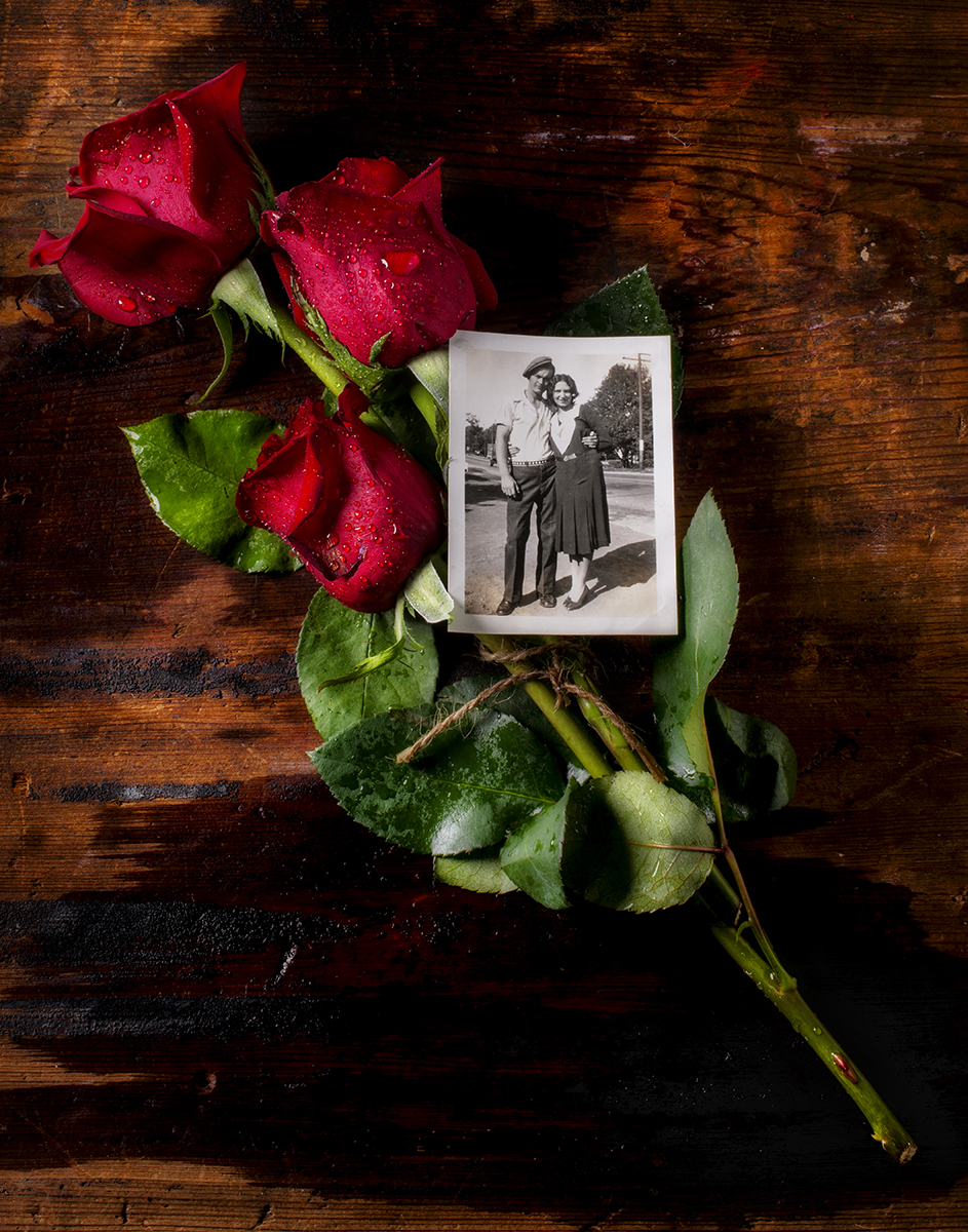
45mm, F/16, 1/125th, ISO 50
Click image to view larger
I created this more poignant photo for a Valentine's Day poster. I have no idea who these people are in this old photo, but I knew they'd work perfectly for the mood I was trying to convey. My background is one of those cutting boards I mentioned earlier. I bought some roses, and to keep them fresh and bright, I sprayed them with glycerin, then added water to create that nice beading you see.
Gettysburg Address and Flag

45mm, F/16, 1/125th, ISO 50
Click image to view larger
Since I'm on Facebook quite a lot, every time there's a holiday, I create what I call a poster I can share. This one was done for a recent Fourth of July, using an 1840 photograph. I also incorporated a reproduction of the Gettysburg Address that they used to sell in the '60s on onionskin paper. I tried to keep the composition as simple as possible, with just three elements: the flag, the Gettysburg Address, and the prop photo. The beauty of how this was shot is that you really can't tell how many stars the real flag has on it, so it doesn't seem anachronistic—it could be the flag in the prop photograph.
Football History Book Cover
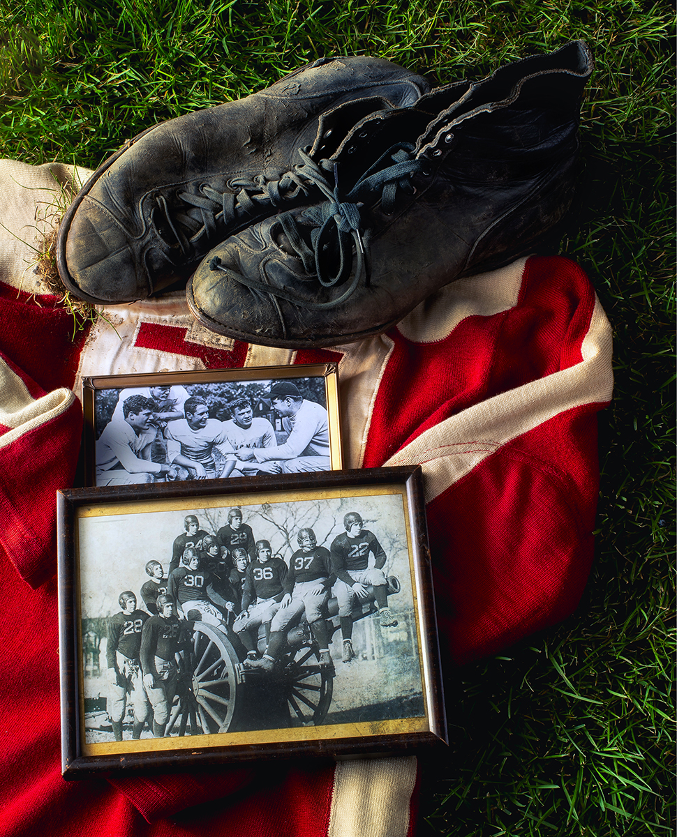
45mm, F/16, 1/125th, ISO 50
Click image to view larger
This was a cover I did for a book on the football history of a private military school in Chicago. The school has been around since 1878, and the author who wrote the book was the head coach for many, many years. The prop photos you see here feature actual cadets who attended the school. The author's father is on the right in the smaller photograph, with the kids he coached. That's also a real jersey from the school, from 1930. I found a pair of football shoes in an antique store from the same year. I brought in sod and built the grass background in my basement, and I placed a little sod on the bottom of the football shoes as well. That's one of those little extra hidden treasures I was talking about earlier, which in this case makes the photo look more authentic. You might not even consciously notice it at first.
Graduation Dress 1910
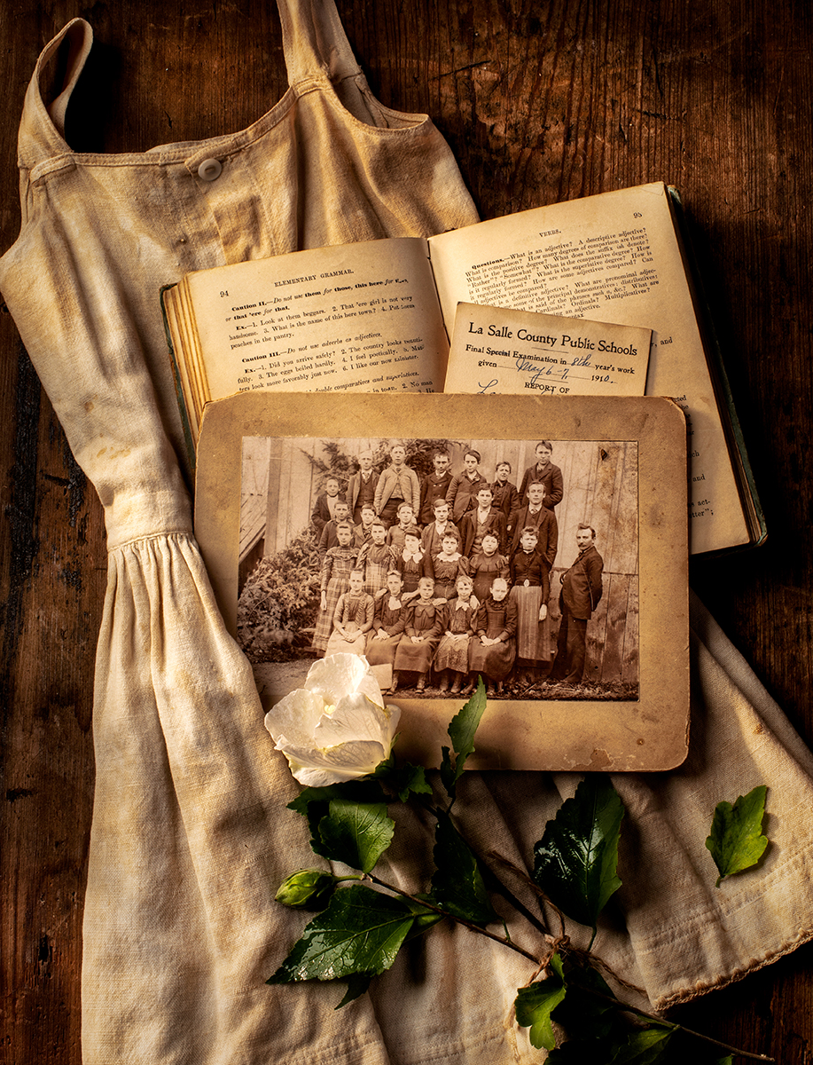
45mm, F/16, 1/125th, ISO 100
Click image to view larger
This is an actual report card from 1910 from a LaSalle County public school. I used a cutting board as a background and added in an old book I had, this old photo of long-ago schoolkids, and a child's dress I picked up in an antique store. It was tiny—it would probably fit a 3-year-old. I wanted to add color into the monotone, like in "Back From the Trail," so I once again placed a flower into the shot.
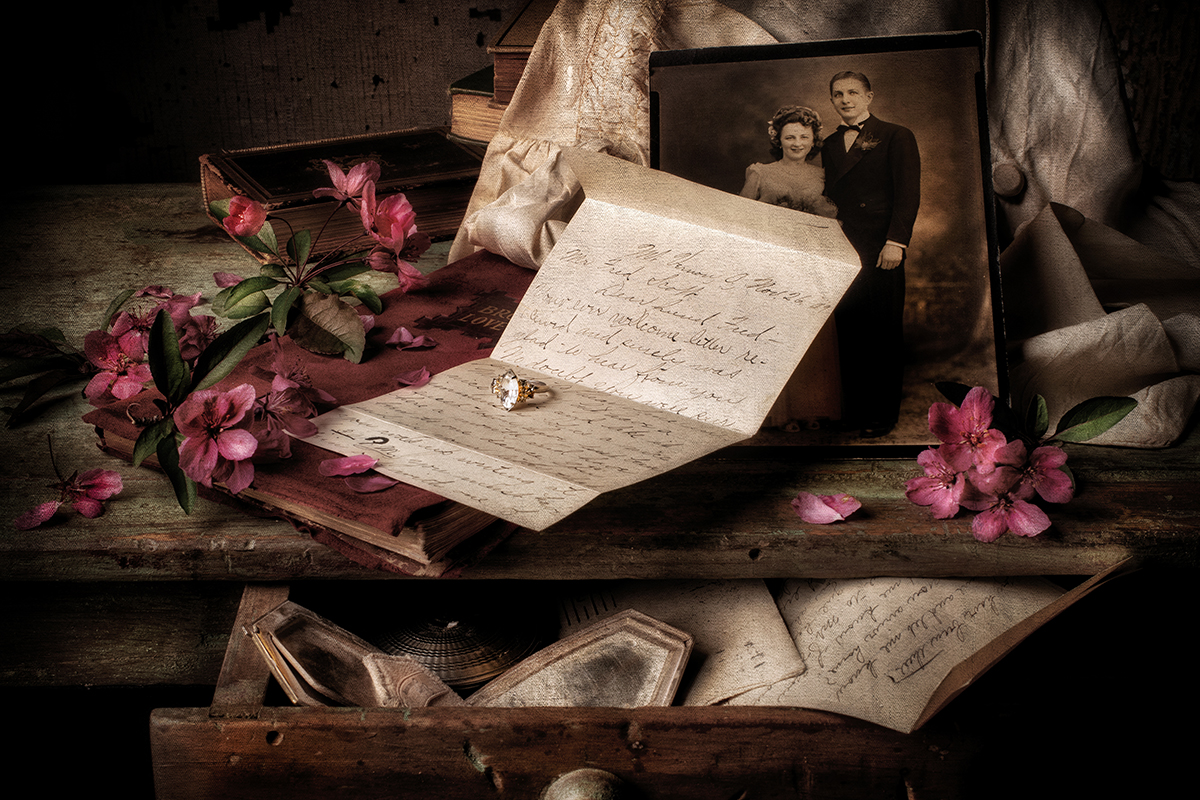
Broken Hearts
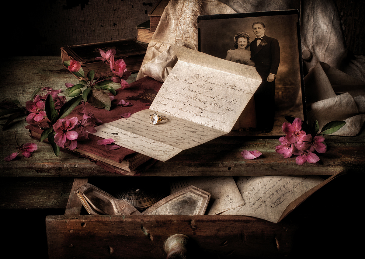
45mm, F/14, 1/125th, ISO 100
Click image to view larger
Each photo is built as I'm shooting it; I'll start at one point and end up somewhere else completely. This picture took me about two hours to put together, from start to finish. In front of our house is a cherry tree, with buds that are only out for two weeks, so I wanted to do something with those—they're such a fabulous color. I had a cheap wedding ring I'd bought for $5 at an antique store. And I put an old wedding photo behind this letter from 1903.
I study all my props carefully before I incorporate them. In this case, I went through about four or five different letters before I settled on this one. I liked the way it was folded and how it started off with "My dear dearest Fred…." When I feature old letters like this, I always try to highlight a word or phrase to convey a feeling or thought. Here, you're not sure at first after reading that greeting and seeing all of the other props if this is a love note, or if the woman who wrote the note left it along with her ring, writing, "My dear dearest Fred…I hate you and I'm leaving." It could go either way. I like to leave that mystery for the viewer to solve. My job is to build a story—what that story is, who knows? Everyone's interpretation could be different, and that's pretty cool.
More Photo Tips | Watch Videos | Learn More About Tamron Lenses | Photo Gallery